A4A Visual Identity
A4A
Co-Founder, Creative Director, Lead Graphic Designer, Organizer
New York, NY, USA
From the outset, we agreed to prioritize fun as a cornerstone of the organization's identity, inspired by Emma Goldman's oft-cited provocation: "If I can't dance, I don't want to be a part of your revolution." Conceived during the pandemic, the work was designed to lift artists out of the darkness of that moment and move them toward mobilization.
Bearing in mind that all design is political, the visual identity was equally a speculative subversion — an exploration of what a cogent counterpoint to Swiss Modernism might look like, emphasizing maximalism and eclecticism, experimenting with justified text, and breaking from the grid. Swiss Modernism, born of a specific patriarchal, Eurocentric context, has long functioned as a handmaiden to globalization, colonialism, and capitalism. To interrogate its legacy felt necessary — and to do so as playfully as possible, leaning into joy rather than righteousness.
Featured:
East Village Zine Fair
Printed Matter, 8-Ball Community
2023, 2024
New York, NY
Hollywood Reporter
March 2021
Playbill
March 2021, February 2023
Member:
The People’s Forum
New York, NY
Awards:
OBIE Award + Grant Winner
New York, NY
February 2023
Logo + Process
The logo was one of the foundational pieces of the identity system. To convey the creative direction — fun, eclecticism, and a departure from Swiss Modernism — I embraced maximalism, hand-drawn letterforms, and vibrant color, developing both a full logo and an abbreviated mark for smaller applications like social media icons.


Inspired by a vintage artists' union pin, Formula Condensed was selected as a primary typeface for both the logo and display copy. The mix of wide and condensed alternate characters creates a playful dynamism — leaning into eclecticism as a counterpoint to Swiss Modernism's insistence on uniformity and minimalism.


Eva, a heavyweight typeface, was selected for the contrast its thick strokes provide against Formula Condensed, and for its lineage: designer Tré Seals drew inspiration from signage used in historical social uprisings — in this case, those associated with Eva Perón.


Given the potentially negative connotation of "anti," I aimed to render it as playfully as possible — choosing colors that evoke a primary school environment, where foundational knowledge is first built.


Leaning into eclecticism as a counterpoint to modernism, I wanted the logo to reflect that variety through multiple hand-drawn letterforms. The hand-drawn element carried its own significance: I was committed to departing from Adobe, whose dominance over the design community has quietly shaped much of our visual culture. It felt important to distance the work from a corporate entity — to rely, as much as possible, on methods that were analog, embodied, and our own.


The final logo features a flexible container — organic, irregular, hand-drawn, and shifting with each iteration — embodying both the playful spirit of A4A and Emma Goldman's invitation to dance. An abbreviated mark was developed alongside it for smaller applications.

Type and Graphic Styles
Formula Condensed remained the primary typeface — its ability to toggle between condensed and wide alternate characters continuing the theme of dance, movement, and eclecticism.
Subverting modernism's preference for flush-left, ragged-right text, I often worked with full justification — embracing rivers as a compositional element rather than a flaw to be corrected.

- All caps
- Alternating condensed and wide characters
- approx. 80+ pt. size or as needed to call out L1 info
- 10-80 tracking dependent on pt. size

- All caps
- approx. 50-80pt. size
- 10-80 tracking

- Sentence case
- 20-50 pt.
- 50-80 tracking





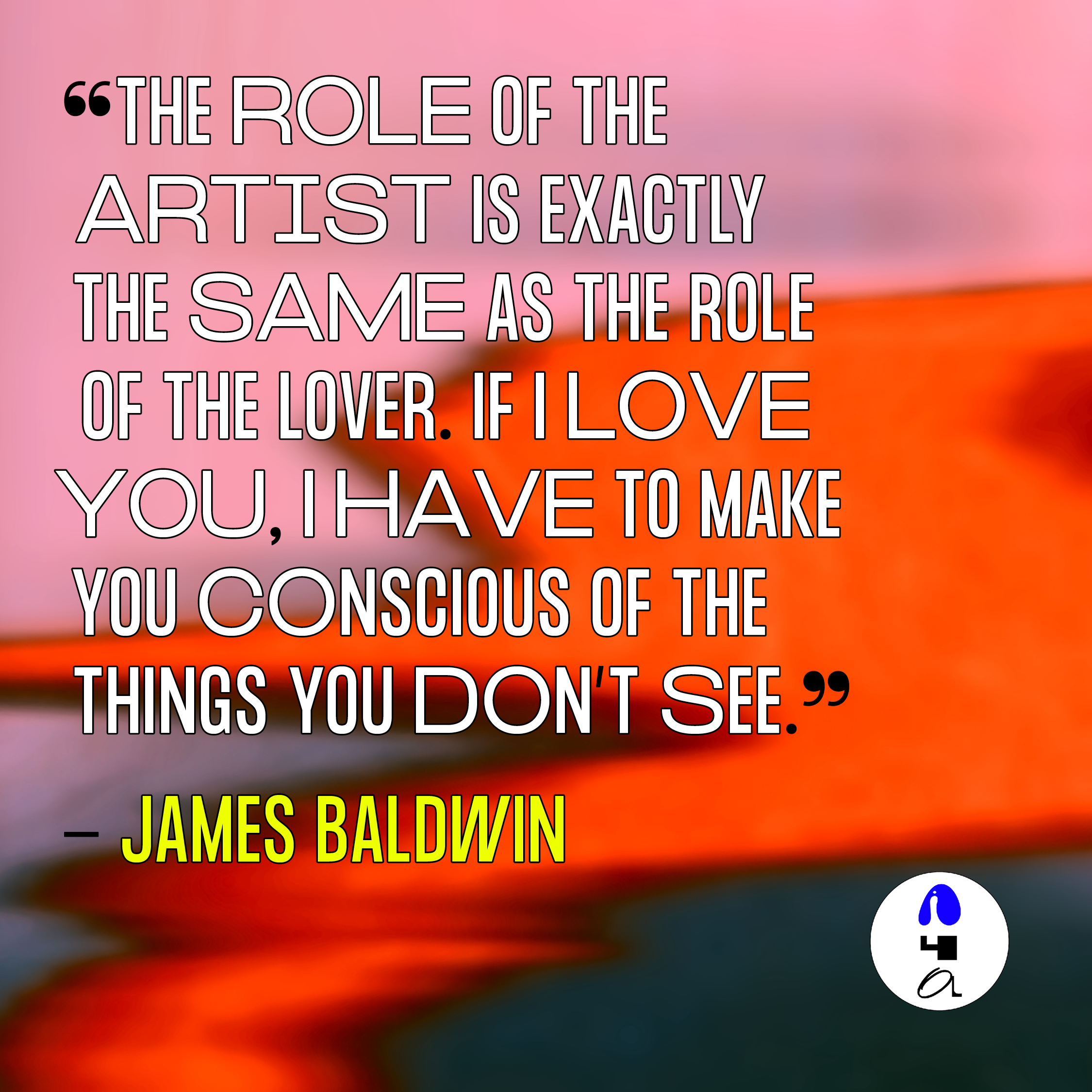
A central tenet of the visual identity was also the use of colorful, maximalist backgrounds. In addition to Emma Goldman's invocation of dance alongside political mobilization, I was inspired by Toni Cade Bambara's directive: "the role of the artist is to make revolution irresistible."
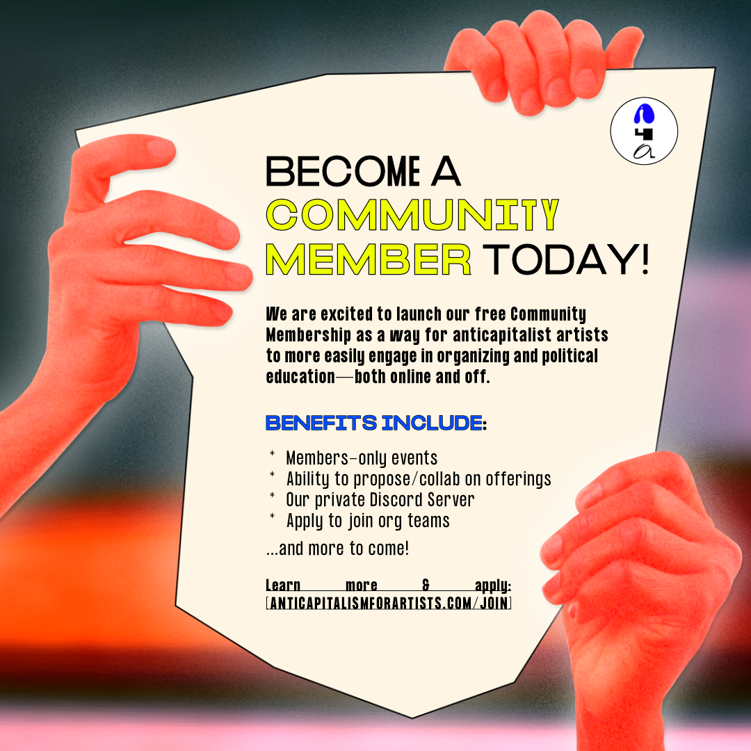
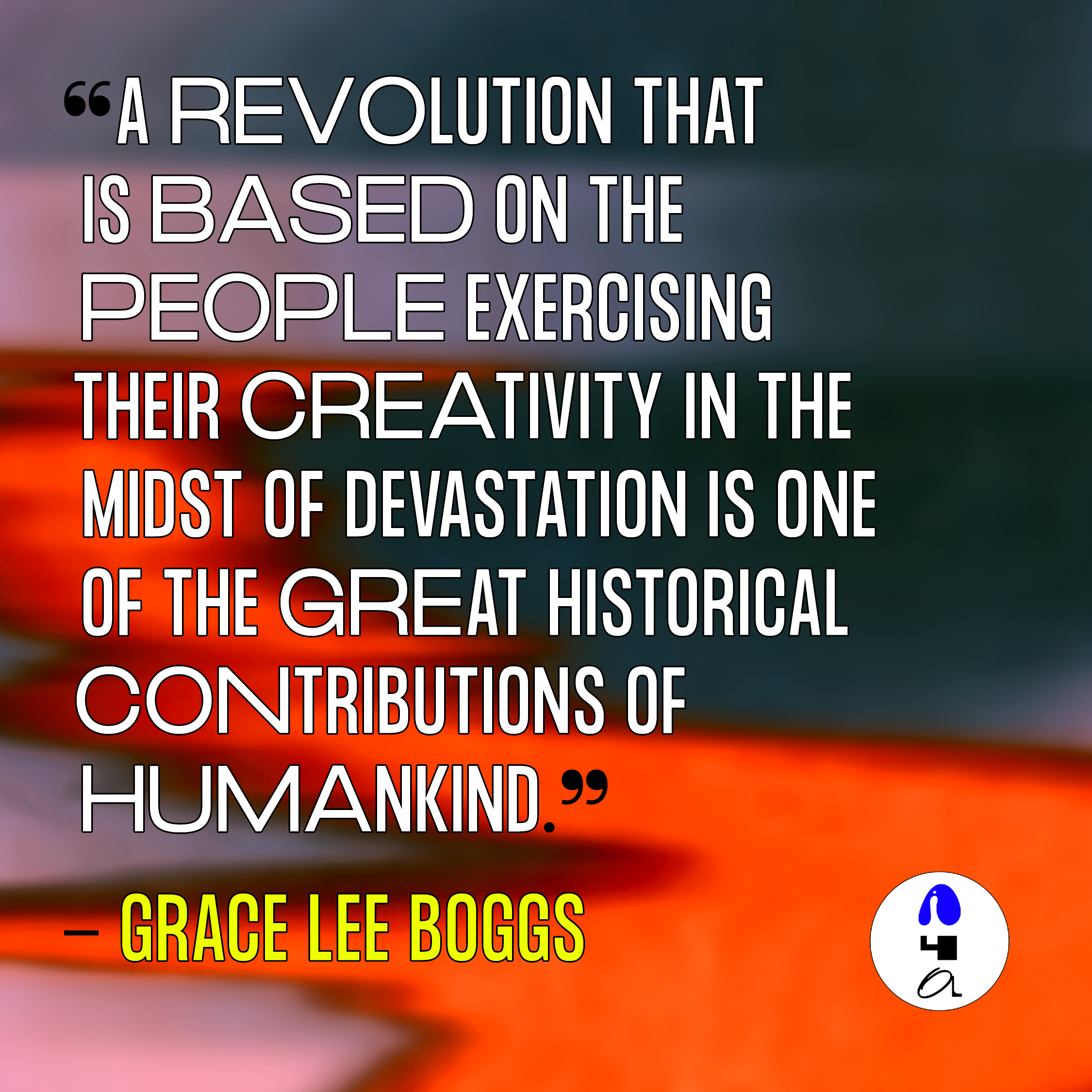
The question of what irresistible visuals might look like led me to explore the sensuality of lushly colored gradients. In tandem, the maximalism of these vibrant, multicolored backgrounds serve as a counterpoint to Swiss Modernism's valorization of minimalism and white space.
The question of what irresistible visuals might look like led me to explore the sensuality of lushly colored gradients. In tandem, the maximalism of these vibrant, multicolored backgrounds serve as a counterpoint to Swiss Modernism's valorization of minimalism and white space.


The method of production stemmed from my personal practice and exploration of scanography.
Scanography is a photographic process that dramatically reduces depth of field and produces highly saturated images with extremes of darkness and light, clarity and blur. The time lapse inherent to the scanning process enhances these contrasts by capturing motion in non-static subjects.
As I explored this mode of image making, I ended up scanning my own face - I was moving quickly through iterations and wanted to test how the process would handle a scan of something organic in form, with movement and varying depths of field.
I explored and iterated upon the original scan by playing with combinations of channel mixing, hue shifts, and blending modes to create fields of color and texture, with a sense of fluid motion to them.
Scanography is a photographic process that dramatically reduces depth of field and produces highly saturated images with extremes of darkness and light, clarity and blur. The time lapse inherent to the scanning process enhances these contrasts by capturing motion in non-static subjects.
As I explored this mode of image making, I ended up scanning my own face - I was moving quickly through iterations and wanted to test how the process would handle a scan of something organic in form, with movement and varying depths of field.
I explored and iterated upon the original scan by playing with combinations of channel mixing, hue shifts, and blending modes to create fields of color and texture, with a sense of fluid motion to them.
Scanned images are can be captured at extremely high resolutions, allowing me to isolate and frame various points in the images to create the backgrounds for various collateral and campaigns.


I constantly iterated upon these visuals throughout the lifespan of the organization and applied them across multiple campaigns and assets — for example in this social media campaign announcing the organization’s community membership program and in this video clip series documenting events from A4A's official launch weekend.