“You Can’t Ban Queer Joy” Poster Series
GLAAD
Graphic Design
New York, NY, USA
In June 2023, amid the legislation of several extreme anti-LGBTQ+ laws across the country, GLAAD launched a campaign for Pride Month featuring a series of 30 posters reading, “You Can’t Ban Queer Joy,” one for each day of the month.
The posters were made available on GLAAD’s website for at-home printing allowing members of the queer community anywhere in the world post in their community or bring to Pride events. Additionally, one poster per day was featured on GLAAD’s social media channels.
I designed three posters for the campaign, with oversight from GLAAD’s Art Director, Dustin Hood.

Process
Being involved in this campaign was very exciting for me, as my personal connection to queerness is closely intertwined with my passion for aesthetics and design.
I very quickly made some creative connections between images that I’d been saving on my phone and brought some ideas together that I thought caught the spirit of queer joy.
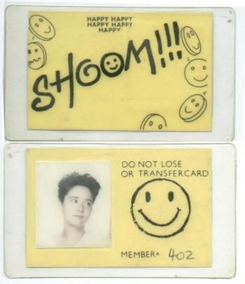

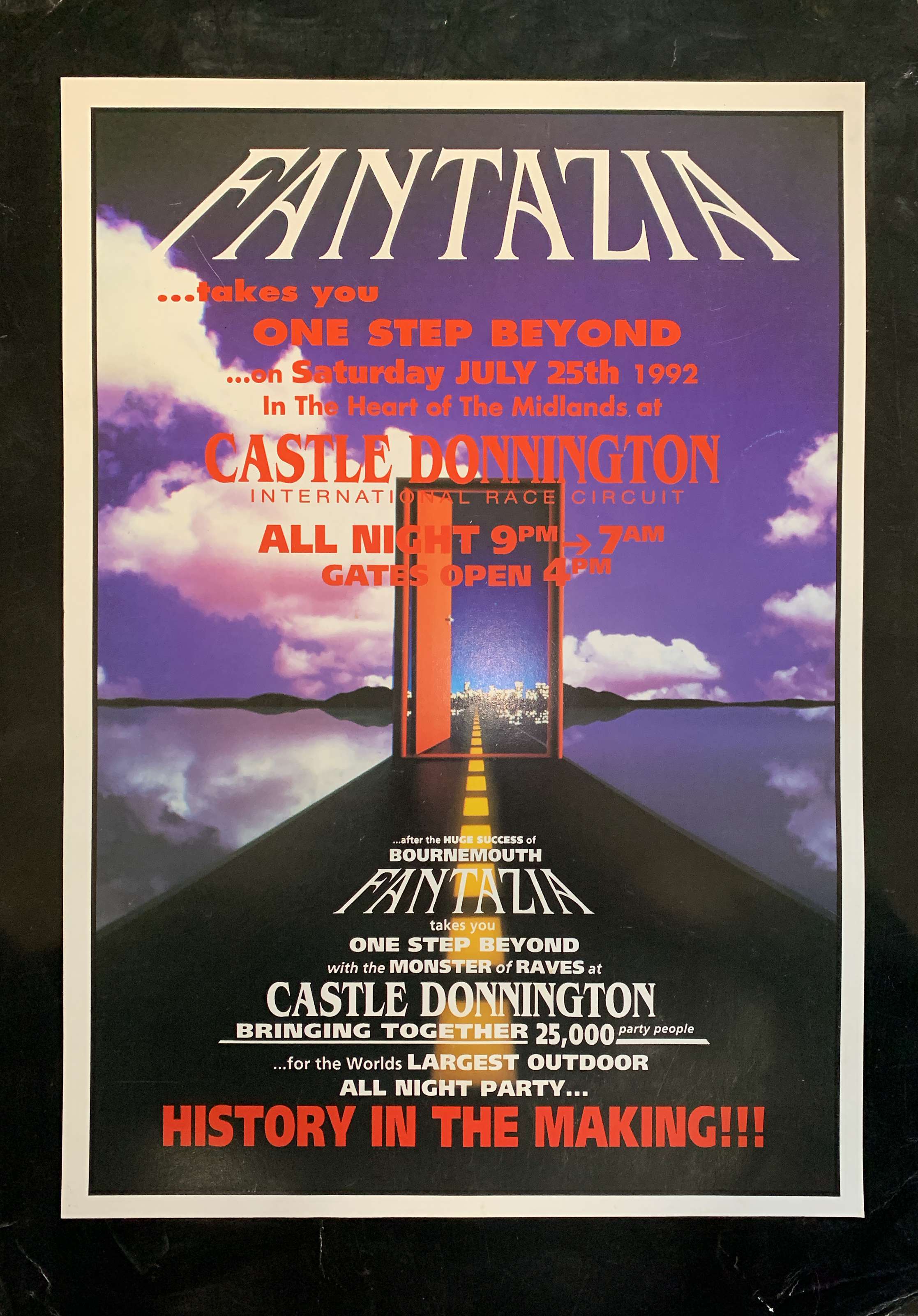

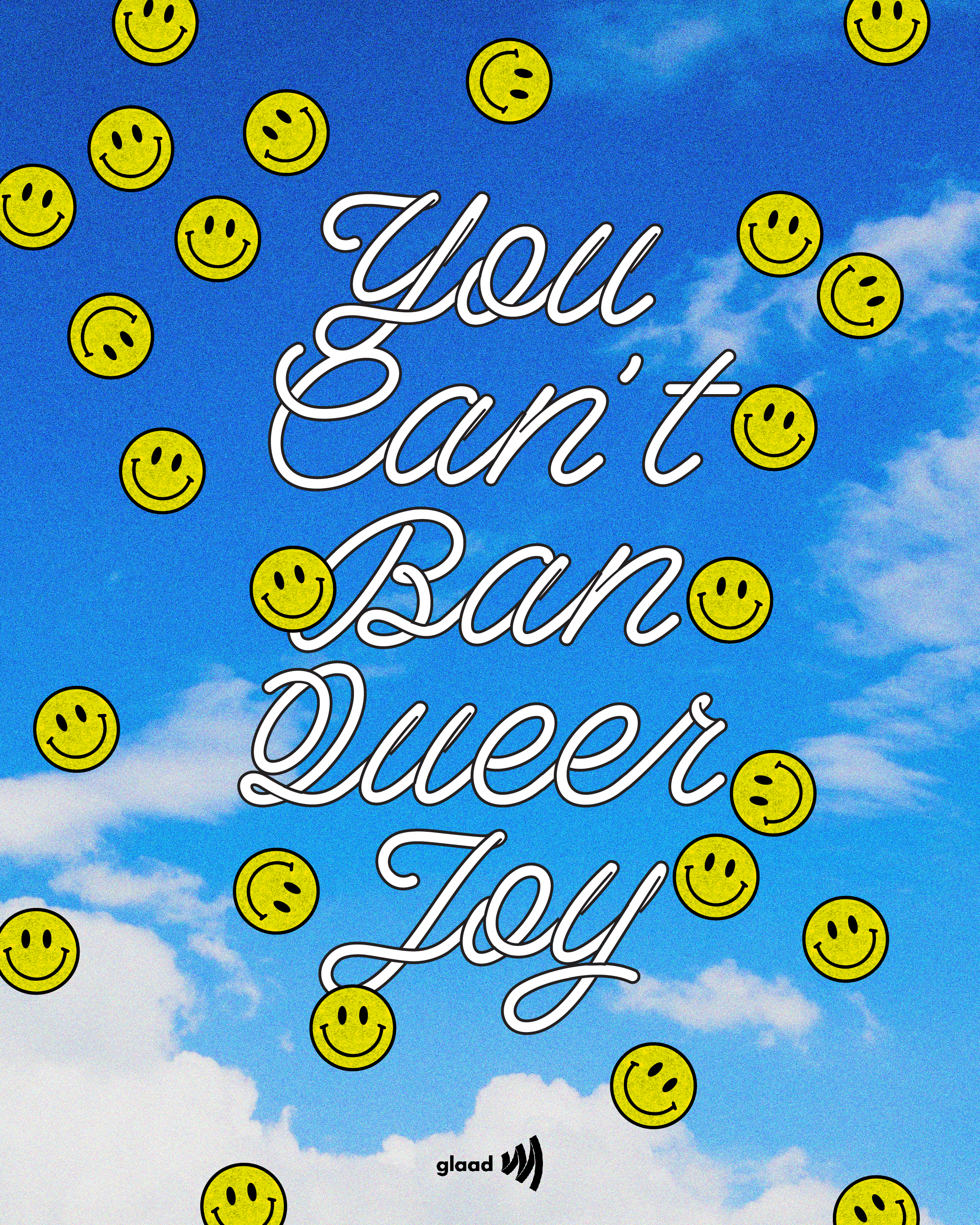
The aesthetics of rave culture in the 1980s and 1990s have always compelled me. Raves were notable for making a deliberate effort to welcome individuals who were frequently marginalized in other settings. A strong focus on aesthetics was prevalent, often highlighting themes of joy and liberation. With parties named “Space” and “Fantazia,” there was also often the suggestion of an opportunity to escape into an alternate realm.
I aimed to convey the concept of "flying away" into a different, joyful world by using a bright blue sky background, while also playfully integrating smiley faces throughout as a nostalgic nod to their significant presence in rave art.
Image sources, left to right: http://www.pinterest.com/artdictator/, http://id.pinterest.com/wizardaura/, www.phatmedia.co.uk/, https://djmag.com/longreads/let-us-be-your-fantasy-how-fantazia-brought-uk-rave-masse
I wanted to pay homage to queer aesthetic ephemera from the 1970s and 1980s that managed to capture a playful exuberance and sense of celebration in the face of harsh conditions and lack of fundamental rights the queer community faced back then.
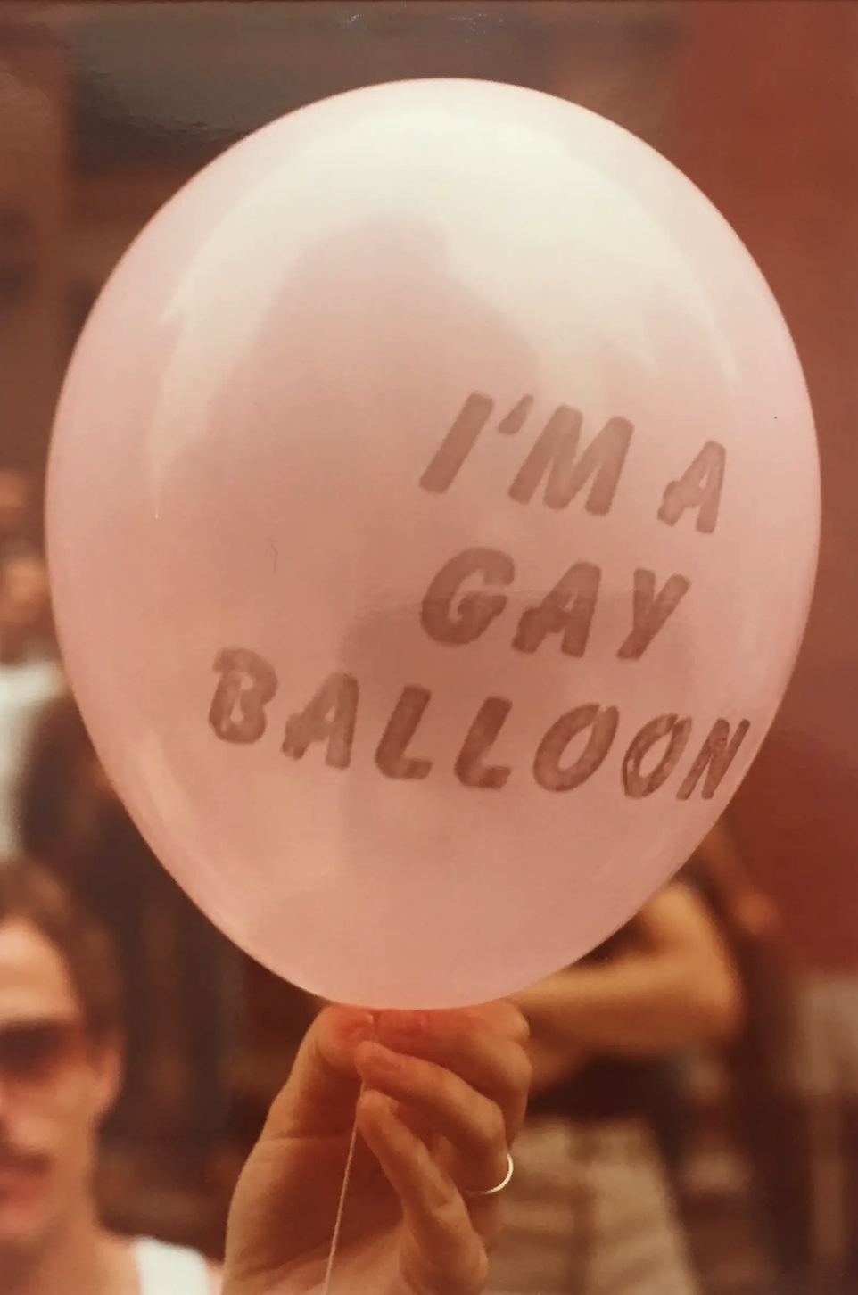
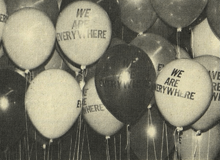
Knowing the HIV/AIDS crisis was concurrently occurring, the levity of the pink balloon from a Pride gathering in the 1980s caught my attention. I was also inspired by this image from the 1977 National Women's Conference in Texas promoting the Sexual Preference Resolution, which demanded equal rights for lesbians within the larger effort for equal rights for women.
I used a bubble like typeface in pink, referencing the first image, and edited an image of a gathering at a queer club with balloons as the backdrop to evoke a vintage quality.
Image sources: https://time.com/longform/pride-parade-photos-1970s/, https://moonbrains.tumblr.com/post/177016934408/we-are-everywhere-balloons-at-the-international
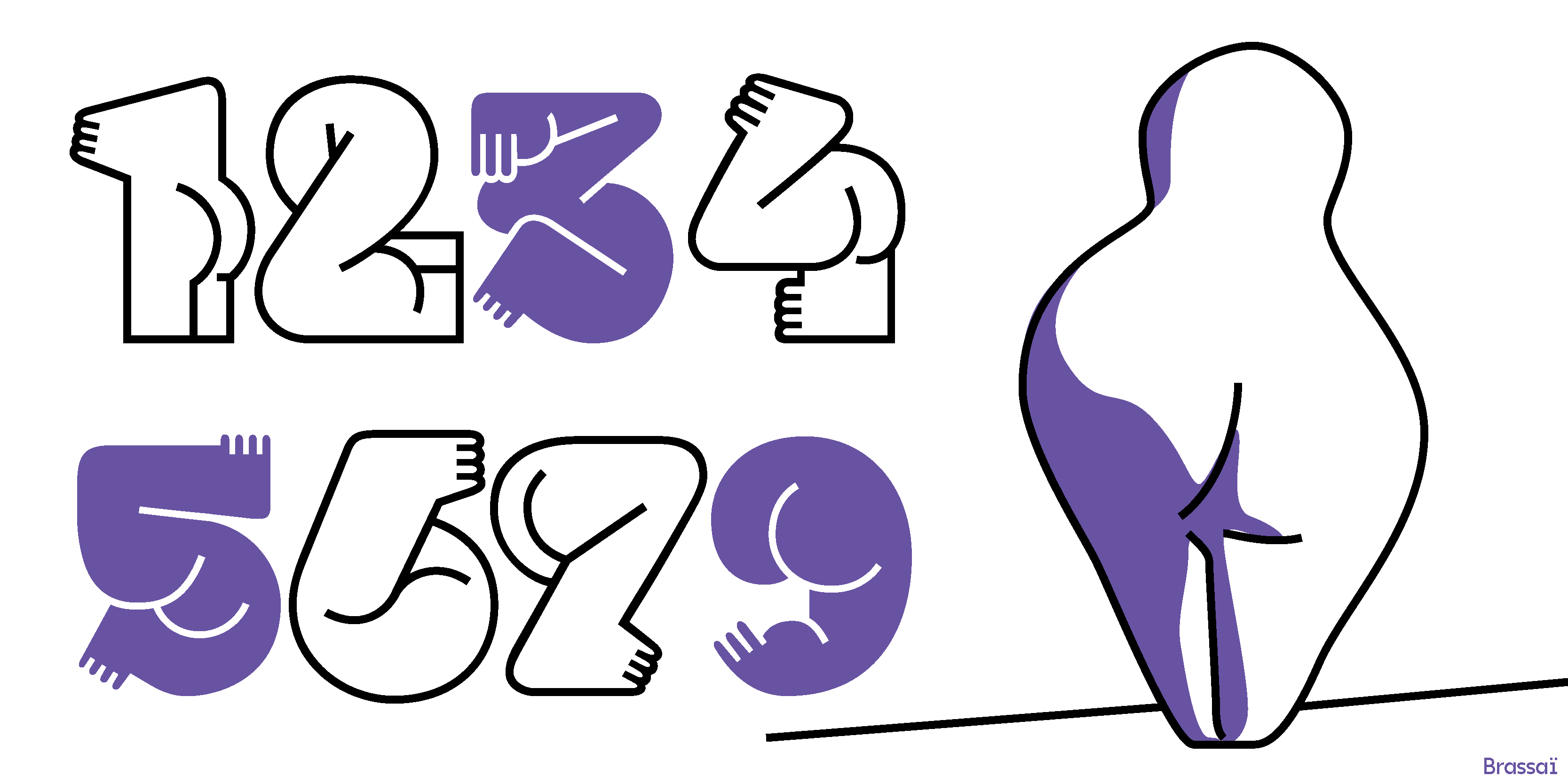
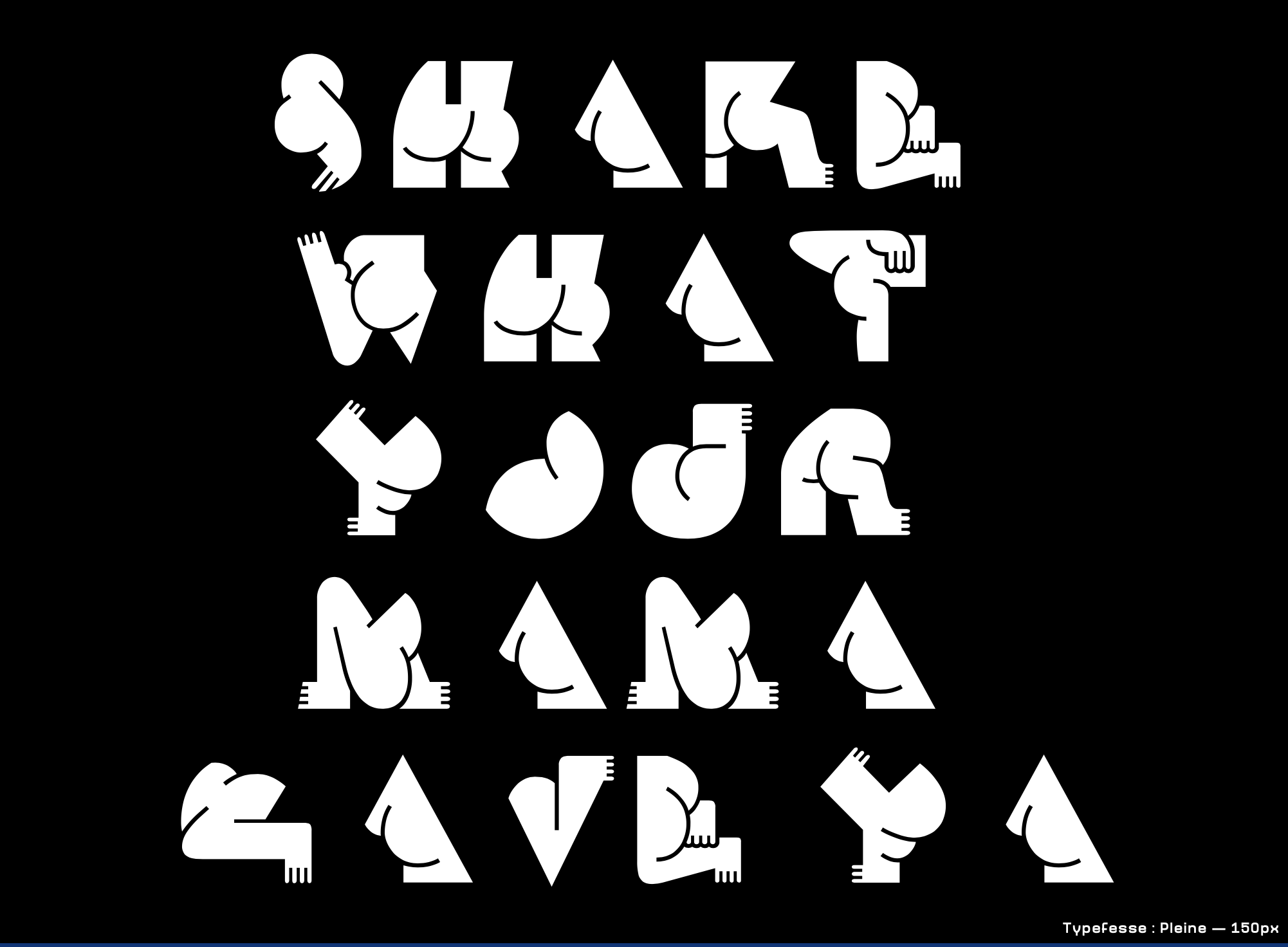
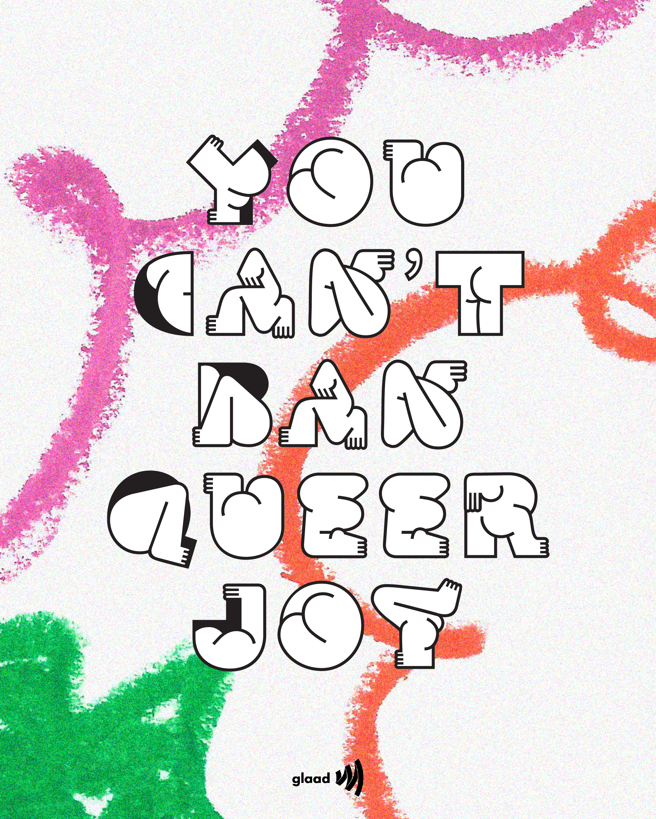
My final poster was an ode to Typefesse, a typeface by Velvetyne Type, whose design explores the idea of the human body’s ability to shape itself in a variety of ways, synchronizing with the alphabet. Thinking about the outlawing of queer bodies and bodily autonomy, its celebration of the human body in different formations resonated with me.
I used a brightly colored pastel crayon drawing in the background to enhance the sense of play and innocence.
I used a brightly colored pastel crayon drawing in the background to enhance the sense of play and innocence.